Interos Risk Scorecard
Interos is an AI-driven B2B tool that monitors risk within a customer's supply chain. The company profile provides a high-level overview of a company alongside a deep dive into its risk data. The value of the product is dependent on the quality of the data it provides.
Risk analysts, procurement managers, and supply chain analysts need to easily navigate the company and risk profile, and clearly understand the data presented, in order to assess the risk of companies within their supply chain or that they're vetting for new business.
My Role & the Team
I was the lead designer on this project, working daily with a product manager and collaborating regularly with engineers on feasibility, implementation support, and design QA. I partnered with a UX researcher to validate concepts and run usability tests, interfaced with data scientists who were providing the risk data, and synced with two other designers for ongoing feedback.
Product Goals
The redesign needed to deliver on four core goals:
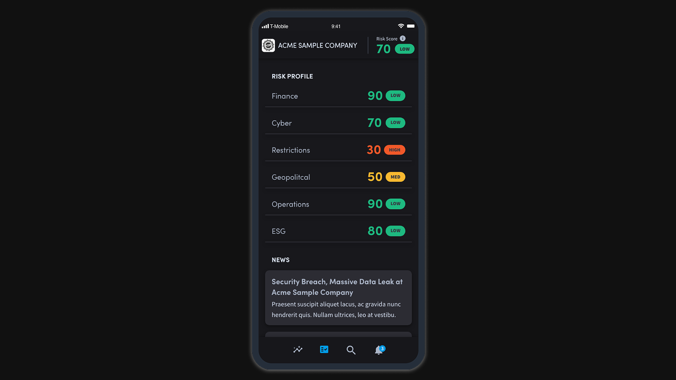
- —Provide a high-level overview of a company's risk
- —Enable users to drill down and digest four tiers of data
- —Show rich granular data with actionable insights
- —Position Interos as a trusted leader in the supply chain industry
Users
The platform served five distinct user types, each with different goals and tolerances for data complexity:
- —Risk managers & analysts
- —Procurement managers
- —Supply chain analysts
- —Third-party consultants
- —Compliance officers
Success Metrics
Success was defined across two dimensions: customer satisfaction; users can easily navigate, understand, and trust the data, and business outcomes; the company wins new business by providing a seamless, data-rich workflow that delivers on what was promised to customers.
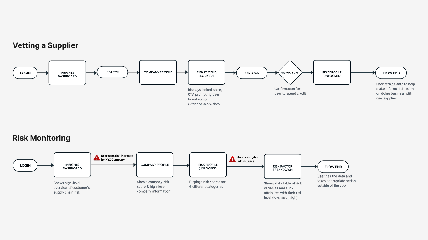
Use Cases
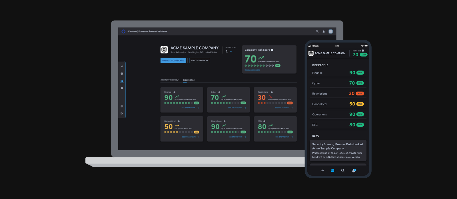
There were two primary use cases: vetting a new supplier before onboarding, and monitoring ongoing risk for existing suppliers. Data was organized across four tiers of hierarchy, from high-level company overview down to granular attribute-level detail, requiring the design to support both quick scanning and deep investigation within the same interface.
Legacy Platform
The existing platform had significant issues that needed to be resolved before the product could grow:
- —No design culture; the interface had never been updated
- —Legacy features and language weren't clear to users; transparency is key to earning customer trust
- —Customers had been promised richer data with actionable insights that the platform couldn't yet deliver
- —The UI wasn't scalable enough to display more data or support new business acquisition
Concept Ideation & Validation
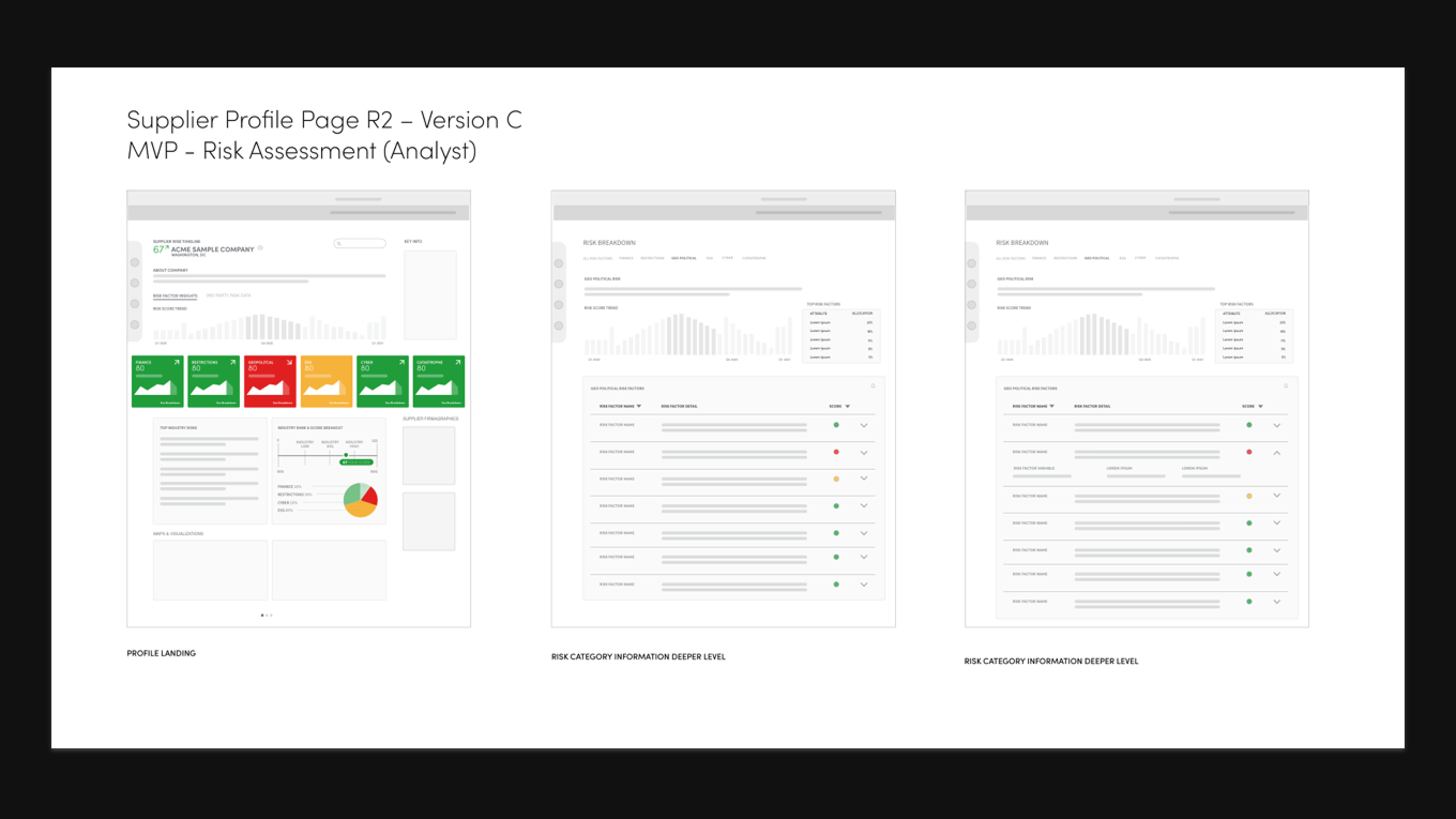
In early concepting I explored drilldown through three tiers of data using a recognizable stock ticker pattern; a mental model familiar to the financial and procurement professionals in our user base. The concept was validated through user testing. I pushed to break the design into deeper pages for scalability, rather than trying to surface everything on a single view.
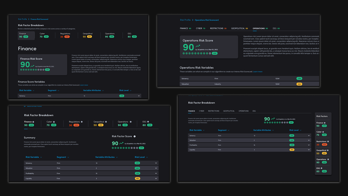
First Iteration
The first iteration exposed structural problems that needed to be resolved before moving forward:
- —Confusing information architecture and visual hierarchy; everything on one page was crowded and hard to digest
- —The team wanted scores omnipresent, but it created duplicative and redundant information
- —Secondary nav included both Overview and Risk Factors tabs, which was confusing and redundant to users
- —Design wasn't scalable for future content additions
- —The working UI didn't follow standard dark design practices; the foreground was lighter than the background
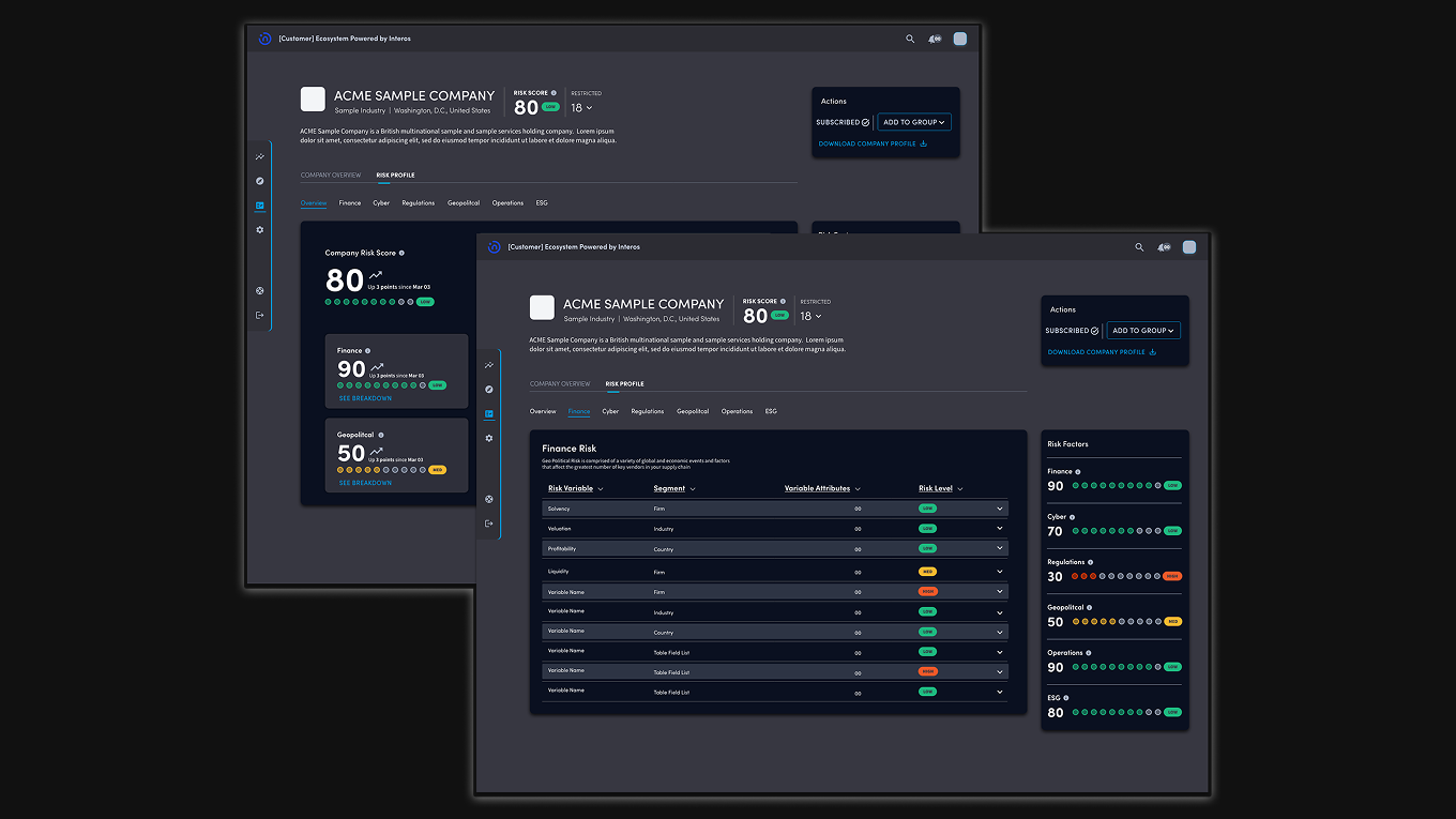
Second Iteration & User Testing
The second iteration addressed the core structural issues. Updated dark design patterns, a breakdown into deeper page levels for context and clarity, and a modified secondary nav that incorporated risk scores directly, giving users orientation without redundancy. In testing, customers could easily navigate and understand the data.
Feedback from this round surfaced the next set of problems:
- —The expanding table still wasn't scalable enough; too many attributes
- —The data and engineering team confirmed they couldn't show accurate timestamps
- —Customers wanted more context on how scoring was calculated
- —Customers expressed concerns about data accuracy and sourcing
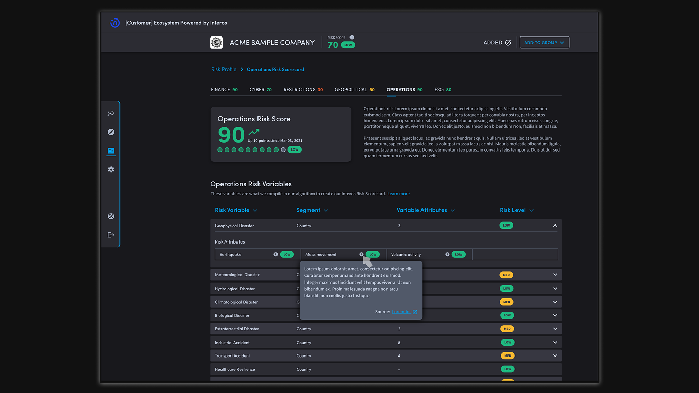
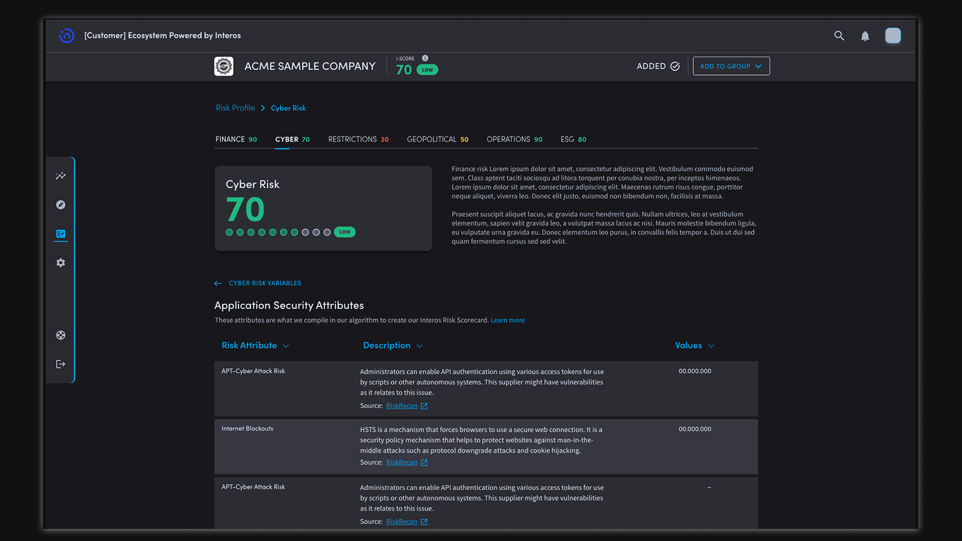
Final Iteration
The final design resolved the remaining issues and established the scalable foundation the platform needed:
- —Deeper table level reveals more attribute information and is more scalable
- —Sticky header reproduces company context and main CTAs throughout deep navigation
- —Easy lateral navigation between risk factors with scores always in context
- —Clear wayfinding through all four data tiers
- —Significantly more space for the platform to grow; more risk metrics, news integration, and additional data sources all have a clear place to live
Looking Back
If I were to do this project again, I'd push harder on defining data content in the early stages. A lot of the iteration cycles were driven by late-breaking data constraints. I'd also conduct discovery research with customers before the first design cycle to better inform initial concepts, rather than validating after the fact.
That said, the process surfaced real issues at each stage and led to meaningful improvements with each iteration.
Moving Forward
The launch was a foundation, not a finish line. The platform has a clear roadmap for what comes next:
- —Work towards accurate timestamps in the data
- —Add back trending arrows and graphs to show directional risk movement
- —Scale to include more risk metrics and data sources
- —Pull in news stories about events affecting a company's risk profile
- —Conduct research and design a mobile companion app
Post-launch survey showed a 10% increase on the System Usability Scale (SUS)
Users could easily navigate, understand, and trust the data across all four tiers
Redesign positioned Interos to win new enterprise business on the strength of the workflow
Established a scalable design foundation for future data, metrics, and mobile expansion